Friday, 14 February 2014

Music Magazine: Contents Page Ideas

In order to get some inspiration for my music magazine contents page, I looked at other music magazine contents pages for ideas.


I like how all of the contents are in a list on the left hand side. Also, how all the colours are simple and work well with each other. This all looks neat and professional. I like how there is a 'Features' section and there is another one for the articles that appear in the magazine every month. I will think about splitting my text up like this.


I like how the front cover is of a close up shot and the contents is a full body, yet also takes center place. I like the usage of the front cover on the contents page. This all makes the page look interesting and relates the two pages together.

I have chosen a picture of the person who I used for my front cover to put onto my contents page in the same fashion as the Q magazine above. I have also picked a concert photo and a photo from the interview out to add to my contents page. They are:


Friday, 7 February 2014

Music Magazine: Finished Front Cover

This is my finished music magazine front cover:


I had an idea of how my magazine would turn out and when actually making it, it all went to plan. I didn't experience any problems with this piece. It was all pretty straight forward and easy once I knew what I wanted.

Music Magazine: Making The Front Cover

After looking at my two potential front cover picture, I chose to go with Sam as not only is he the one who did the interview photo shoot but I think his picture will look best. I started off by cropping the chosen picture of Sam to be a head-shoot and then Photoshopped him to look better. This was essential as all main images of magazines look flawless and are most likely Photoshopped.


The beginning photo. ^


The cropped and edited photo. ^ (I edited the image so the brick background was a separate layer from Sam so that I could put the masthead behind Sam's head as this is something many established magazines do and I want mine to look authentic)

I then started off by adding in my title 'DIVERSE' to the top of the image. I left a small space above it so I could fit in text above. I also put it behind Sam's head, but you can still read what it says.


 I then put in a red box across the top to give the page some colour. Then I put text on top. I put this in white as it contrast the red nicely and stands out. I used the formal font from my research for this text.


I then added a black box at the bottom of the page and then added the text on top. I made this unique by using the bands actual official fonts for their names. I also used the formal font for the 'PLUS!' so that it didn't take the attention away from the band fonts.


 The next step was adding in the bar code, date and website. I made a white box and then put an image of a bar code, then wrote the text in. I merged these layers together to create a compact, neat box and then put it vertical as I was inspired to from a magazine I had researched and also I think it looks better this way.


 I then added in my anchorage title and the sell line that went along with that. I placed these across Sam so that the audience would know that it was to go with the main image. I put the anchorage in red as to add more colour to the page as it seemed like it was lacking. When I tried the sell line in red, it looked too much. I also put a white outer glow on the anchorage title and a black stroke around the sell line to make them stand out even more.


The page looked a little bare so I added in another sell line in the empty space next to Sam's head. I typed this to fit well into the space so it wouldn't overlap Sam so that the audience know that that particular sell line isn't in relation to the main image. After I had done this, my magazine was complete.


Friday, 31 January 2014

Music Magazine: Front Cover Ideas

For my music magazine front cover, I will go with the typical conventions such as using a medium shot, having a big, bold title at the top. Including all the necessities such as sell lines, a large anchorage title, bar code, price, date, etc. I came up with the idea of having a band of three called The Thieves who have recently became two, so for my front cover, I will be using a photograph of the band member that will be interviewed on the double page spread. I will also make the main sell line to go with the story. I also have decided to name the magazine 'DIVERSE' as it will include a diverse range of artists. I have looked at music magazine front covers for inspiration. Here are some things I have picked out:


[nme-front-cover-29308.jpg]


 What I like about this front cover is the bar code. Instead of being horizontal, it is vertical. I like this as it gives the magazine that extra edge and uniqueness. I think I will do the same for my magazine front cover. I also like the colour scheme: it's mainly black, white and red. This is a common colour scheme for a music magazine. There is also a hint of yellow, which is also common, but I think it can look too much if not used appropriately. I don't think I will use yellow on my front cover.

What I like about this magazine front cover is the coloured banner going along the top with text overlaying regarding a competition. It's placement at the top is obviously to grab peoples attention and I think it does a good job of this and will consider this idea when making my magazine. I also like the banner going along the bottom which includes some of the other artists that are in the magazine. I want to include something similar to this in my magazine but put my own spin on it so it separates my magazine from this one.


Friday, 24 January 2014

Music Magazines: Font Research

I looked at a wide range of different fonts for my magazine masthead and sell lines. I wanted to see which suited the masthead first and then consider the other fonts for the sell lines so I tested them all through typing the title. Here are my favourite fonts out of the ones I have looked at:


 Buxton Sketch


Mesquite Std


Blood Crow


Birch Std


 Zombified


I really like all of these fonts but my favourite one that I think will be the most eye catching and look the best as a magazine mast head is the last one: zombified. However, I do want to incorporate the other fonts into my magazine. I will use a few of them for the sell lines. I think some will be more predominant that others. For example, Birch Std looks too formal to be used for any main piece of text as I want to keep the page looking interesting. I think I will use Blood Crow for my main sell line as it is my second favourite and I think it will help make the page appeal to the audience.

I then looked at band fonts. I managed to find three:


I will use all three for my front cover as it helps the readers familiarize with the band as they may recognize the font. Also, it will make it look more professional as these are the fonts that the band themselves use.

Music Magazine: Logos


In order to make my magazine more realistic, I will add logos to it. I will use the following images:


If I was making this magazine for real, then I would need to get permission to use these logo images.

Friday, 17 January 2014

Music Magazine: Concert Photographs

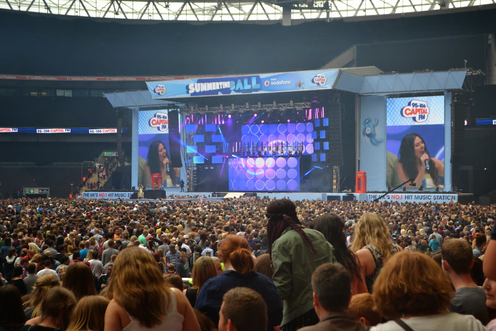
In order to give my magazine more diversity regarding artists, I will add in some concert photographs I have taken myself. These are the photographs that I can find and have to choose from:


One of the best pictures from a Beyonce concert.


This is the lineup for the photos that follow. 


  This is quite a good picture as it had the artists name in big, at the back.


There are a few photos of artists in the stage at the middle. These pictures aren't as good as there is no establishing pictures behind them and the artists them self almost blend in with the crowd.


 By this point, my camera died so I had to switch to a camera phone so the pictures aren't as good quality.


They consist mostly of the Capital FM Summertime Ball as I couldn't find any other good photos and I took these photos using a DCLR so considering the distance I was sat, they are fairly good quality. The other photo in this lot is from a Beyonce concert I attended. I took photos using my phone so they didn't come out very well. I thought if I add this photo in small then it could look good. I will experiment with the photos and discard ones that don't look good or fit well.